


Summer is around the corner, and we are back to enjoying the sun, the sea and a fresh, crisp and cool interior. Interior Stylist Bettina Deda shares some of her favourite colour combos for the summer months.
COMBO NO. 1: BLUE / GREEN
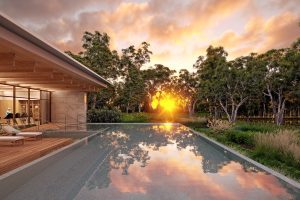
 We associate the colour blue with the ocean and the sky; therefore, we see it as a constant factor in our lives. Blue is one of the most popular colours and described as the favourite colour by many people, especially by men. The word itself comes from the Old French word bleu. Blue evokes feelings of calmness and serenity. We describe it as peaceful, tranquil, secure and orderly. Dark navy blue is the most serious and powerful blue, whereas lighter tones of aqua can be uplifting and energising. Turquoise enhances creativity, inspiration and transformation.
Green is a secondary colour created out of yellow and blue and is sitting next to blue on the colour wheel. Like blue, the colour green is associated with nature and surrounds us every day. Green is in the middle of the colour spectrum – the great balancer. It evokes harmony, relaxation, calmness, serenity, new life and freshness. Green influences the body on the mental and physical level. It helps to cure nervousness and anxiety.
Green works well in areas of the home where you would like to create a calm and serene atmosphere. And nothing is easier than introducing pot plants or green cushions and accessories to enliven your space – without painting the walls. Plants not only clean the air, they add a splash of colour to your room and can easily be moved around and changed. They can help making a small space appear larger as they optically recede.
Combine blue and green for a fresh and relaxing colour scheme. Use this combination in bedrooms, lounge rooms, reading areas or in your bathroom. Mix tonal variations of blue and green – all tones of both colours work well together – to create an exciting colour scheme. Blues can be navy, aqua or pastel blue; greens range from apple green to teal or mint.
Sometimes our fate resembles a fruit tree in winter. Who would think that those branches would turn green again and blossom, but we hope it, we know it.
Johann Wolfgang von Goethe
COMBO NO. 2: GREY AND YELLOW
 Grey lives in the middle between black and white and seems to have no own personality. For some people grey is dull and depressing, think of grey rainy days, or grey faces. In interior styling, however, grey in all its shades – silver, oyster, pearl, mist, driftwood, aluminium, flannel, pewter, elephant, ebony, cement, zinc, steel, smoke, cashmere, dolphin, ocean, donkey, or pebble – to name a few – is a versatile and flexible colour. It is a fantastic background for brighter hues as yellow, red, pink, or purple and can round any interior.
Grey is the colour of nuance and dialogue and a metaphor for a mature and truly democratic lifestyle. The family of greys permits all other colours to lean against them, to underline or overshadow them. Grey is patient and flexible and an appeasing tone in times of change and financial crisis.
Lidewij Edelkoort
The colour yellow is associated with optimism, happiness, and the sun. It enhances positive thoughts and creativity and signals power.
Use yellow in your interior to create a stimulating atmosphere. Yellow adds a warm, happy and welcoming feeling to the entrance of the house. Bright yellow works best as accent colour and pairs well with shades of grey for a very contemporary and welcoming look. Neon yellow is currently very trendy and looks great as the accent colour paired with pastels. Use yellow in artwork, cushions, decor, or an area rug to inject a splash of colour to your interior.
How lovely yellow is! It stands for the sun.
Vincent van Gogh
COMBO NO. 3: WHITE AND PASTELS
 White is a neutral background colour but is also used to highlight stronger hues in a colour scheme. By mixing colours with white (tinting) you can soften them to pale pastel shades, soft, delicate hues with a washed-out look. The word ‚pastel’ comes from the drawing medium of dried paste made of ground pigments and a binder, that is manufactured in crayon form.
 Bright, breezy, light, summer, young and fresh, joyful, lifting the spirits, colour of purity and innocence – words associated with the colour white. White is a mixture of all colours in the visible spectrum of light, and the word ‚white’ comes from the ancient word for light. White reflects 100 per cent of light. It aids mental clarity and encourages us to clear away clutter and remove obstacles.
As it reflects 100 per cent of light, it is a great choice for darker areas in your home. However, be aware, to choose the right white is not an easy task. There are more shades of white available commercially than any other colour. If appropriately used, white introduces a cool, airy, summery feel to the space. White accents are useful to break up a dominant colour scheme.
The first of all single colours is white. We shall set down white for the representative of light, without which no colour can be seen; yellow for the earth, green for water, blue for air, red for fire, and black for total darkness.
Leonardo da Vinci
A stylist’s tip:
Layer patterns and textures in your chosen colour scheme to make your home interesting.
 About
About
Bettina Deda
Bettina Deda is an interior stylist, colour consultant, artist and director of Bettina Deda Colour Design living. Originally from Germany, she moved to Sydney in 2008 and completed several studies including a CERT IV in Colour and Design and a Colour Design Diploma at the International School of Colour and Design (iscd). As a born organizer, she published an ebook to successfully manage DIY home renovations Style to Impress and her second book Downsize in style. In May 2013 she launched her first fabric range for soft furnishings inspired by her hand-painted original artworks.
Downsize with Style is now available for Amazon Kindle and iPad. Bettina has also launched her Downsize With Style podcast show on iTunes. Check it out at:
https://itunes.apple.com/au/podcast/downsize-with-style/id889540184
For more information on Bettina and her work, go to www.bdcolourdesign.net.au


Add Comment